
When I was in high school and college, I cleaned at at an assisted living home during my summer breaks. I was there every day for 3 summers in a row and I had that place memorized to a tee. Oddly enough what stuck with me the most was the art that lined the hallways. Most of which were puzzles that the residents had completed, but there was a particular piece of art next to the elevator that was divided into a trio of frames stacked side by side. I can’t say I liked the art necessary…but I was drawn to it for some reason.
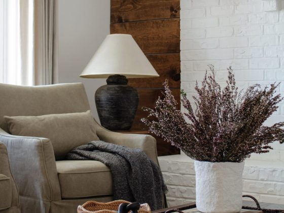
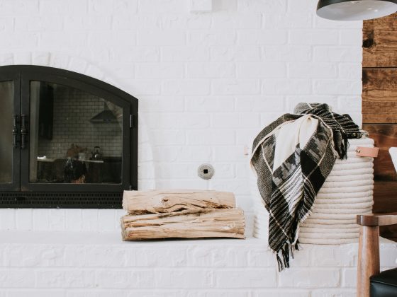
Art is powerful. Art is memorable. One new piece of art can make an entire room feel different. It sets the tone of the room and it can be the final piece of the puzzle or a starting point for a full refresh.
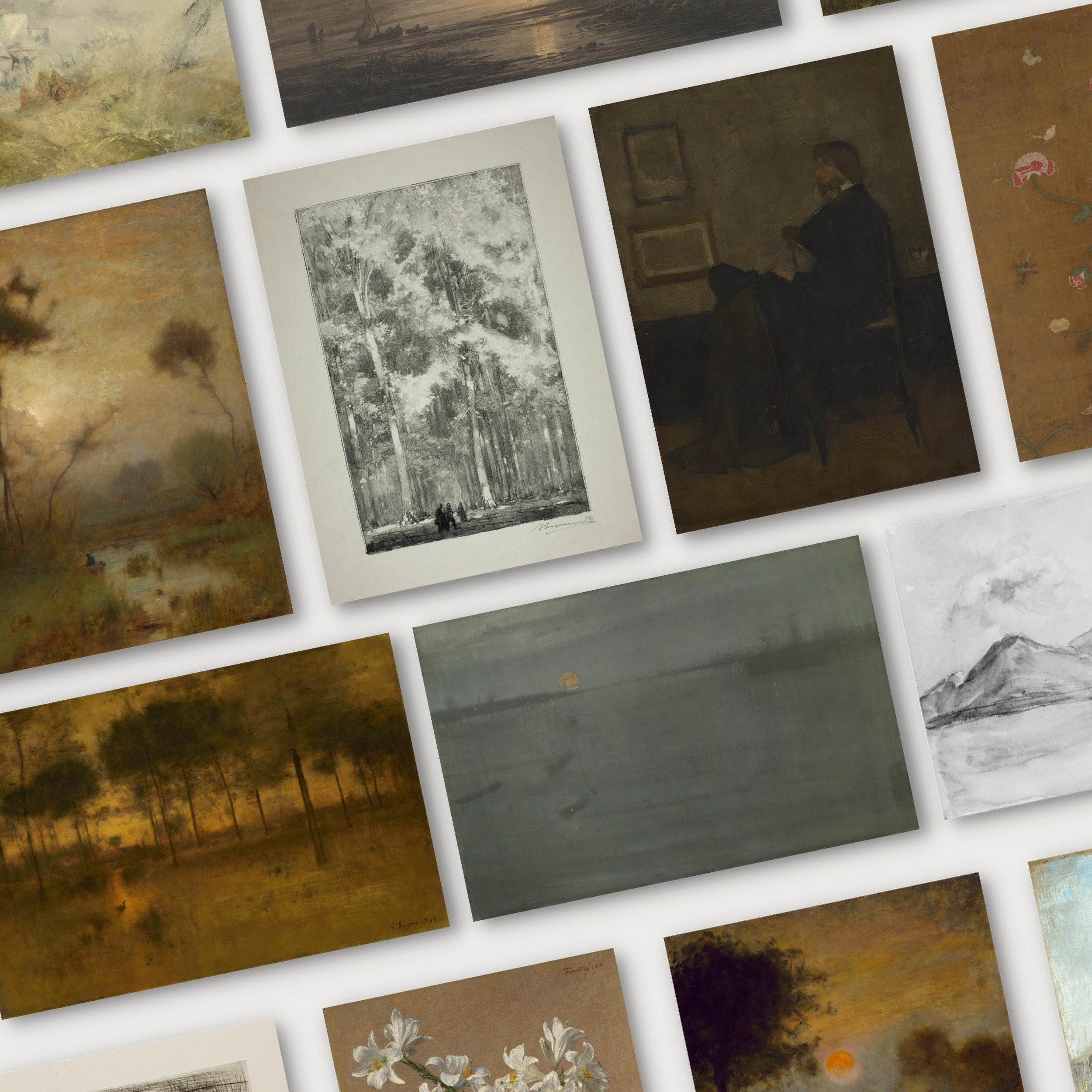
Over the past 3 months, I’ve been working on a little something for you guys! A new collection of free art and I’m so obsessed with this compilation. I’ve done this before actually…2 years ago I compiled 19 vintage prints from the NGA public domain library. But change is fun so I gathered 14 MORE vintage prints for you to download for free!
**According to the Art Institute of Chicago, The Met, and the Smithsonian, every piece in this collection is in the public domain making them free to download, print, and use in your home.
These are some of my absolute favorites! Moody and earthy tones mixed with sketches and still life. I sifted through thousands of copyright free artwork to find pieces that I wanted to incorporate in our own home and I had a feeling you guys might be just as excited about them. I’ve scattered them throughout our house! #1 and #2 are in our living room, the woman sketch portrait made its way to our office, and my favorite piece (shown below) is sitting on our bedroom dresser. Something about that shade of blue, the shadows of the ships in the distance, and that little pop of orange has me weak in the knees!
I printed all of these downloads through Mpix. They’re an online printer that offers great quality prints and incredibly fast service. Mpix also offers Giclee printing (highly recommend!) which is higher quality form of printing that gives you the richest, most accurate colors. From there, I like to print my artwork on either canvas or fine art paper. I’ve done both and loved the results!
Canvas is perfect for paintings. Because digital paintings often have “texture” within the print, canvas is the ideal backdrop to make that texture feel realistic. Fine art paper is great for sketches and drawings or any piece that doesn’t have a ton of texture within the print. If you want your print to have a durable backing, add a matboard to your fine art print. My rule of thumb is to print on the type of material that I assume the original was on for the most authentic look.
Then comes my favorite part – framing! I scoured local antique shops for weeks to find a dozen perfectly distressed frames and that’s key #2 to making antique art appear original. Nothing beats the authenticity of a vintage frame and the dings and scratches that come with it.
I like to remove the glass if I have canvas or a print with “texture.” The matte finish of the print alone usually sings to me more than the reflection of glass. But every once in a while I’ll leave the glass in for sketches or line drawings.
You know my favorite print from the collection, what’s yours??